The Cost Analysis View is a dashboard that visualizes various performance metrics collected by AIBooster, specifically designed for business leaders responsible for operational costs.
In this demo, you can access the Cost Analysis View provided by AIBooster, installed on Fixstars' internal GPU server (NVIDIA H100 x 4), directly from your browser.
What you can experience in this demo:
- View the Cost Analysis of running supervised fine-tuning on Llama3 8B.
- Check metrics such as the total system cost during the observation period (Total Cost), the incurred costs even when GPUs are idle (Idling Cost), and the monetary value representing efficiently utilized GPU time due to optimization efforts (Boost Bonus).
- Analyze changes in the above metrics within a specified time frame.
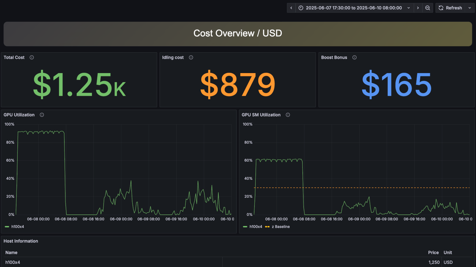
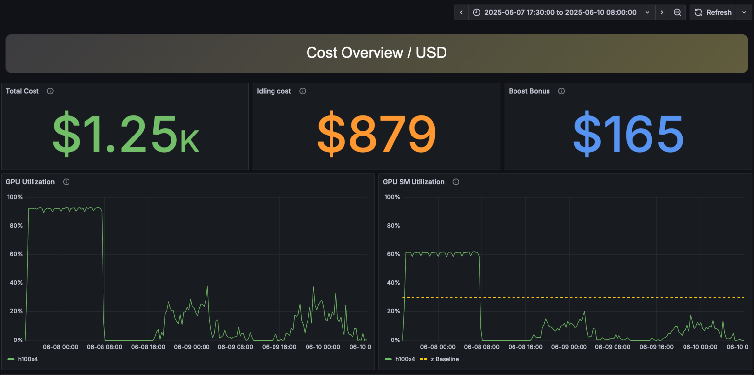
The top-left panel of the Cost Analysis View shows the total operational cost incurred by running the system during the observation period. The displayed cost is calculated based on typical cloud service rates. In the production version, you can customize cost calculation formulas to match your environment.
The top-center panel illustrates the costs incurred during periods when GPUs were completely idle. Although it’s challenging to maintain GPU utilization at 100% continuously, reducing this "Idling Cost" should be a key indicator for achieving more efficient GPU usage.
The top-right panel shows the monetary value gained by utilizing GPUs more efficiently than standard benchmarks. This value, referred to as "Boost Bonus," essentially represents savings achieved through optimized GPU usage. The Boost Bonus is calculated using 30% GPU core utilization as a baseline, multiplying any additional utilization beyond that by the hourly cost rate. You can further enhance this metric using AIBooster's Performance Intelligence (PI) features.
Following the cost-related panels, you will find:
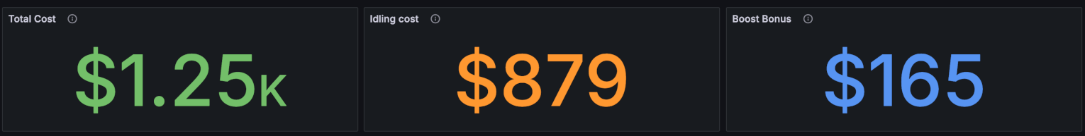
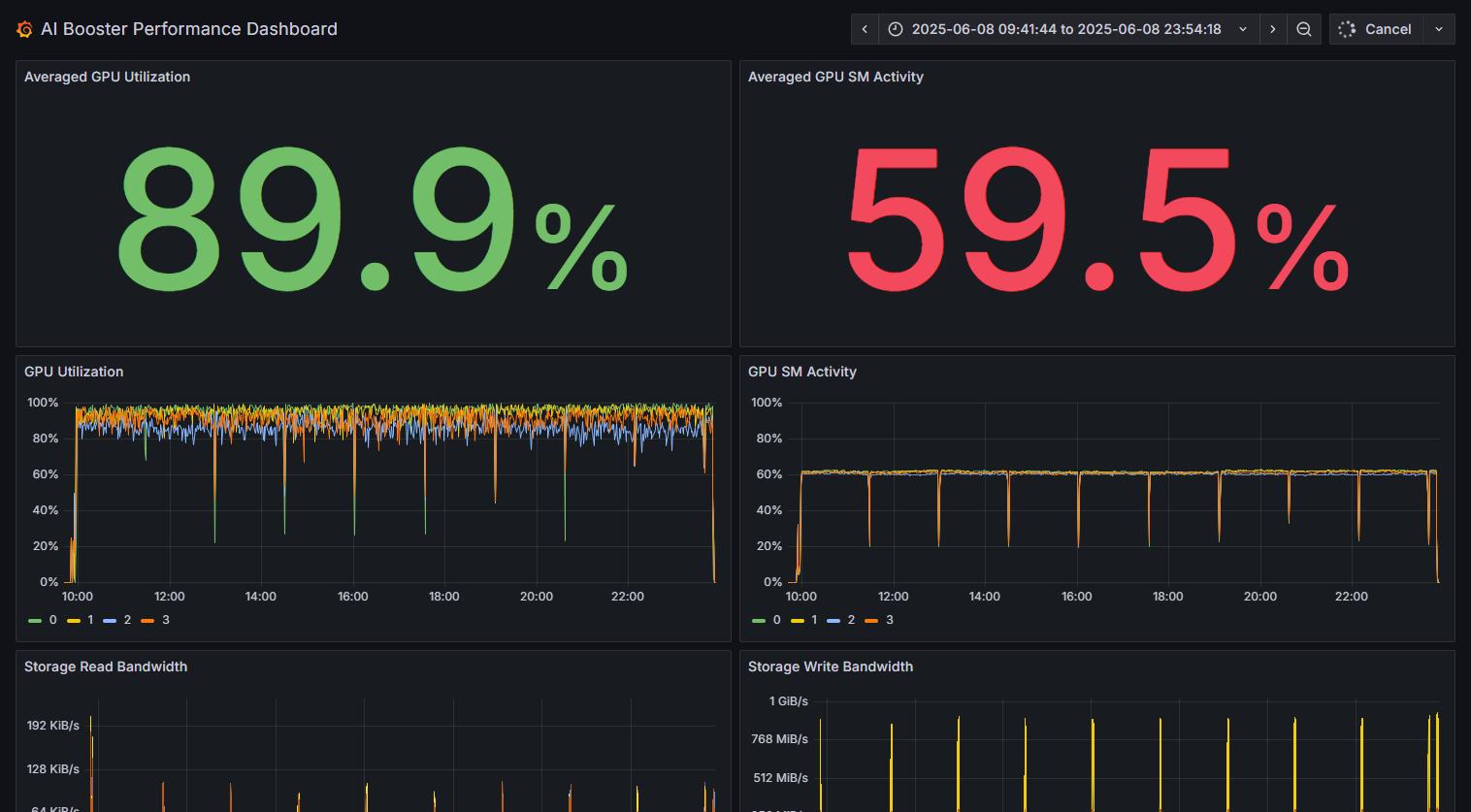
- Left panel: A time-series visualization of average GPU utilization during the observation period.
- Right panel: A time-series visualization of average GPU SM utilization during the observation period.
SM stands for Streaming Multiprocessor. Each GPU consists of multiple SMs, and the right panel displays utilization at the SM level. Even if a GPU appears to be running at nearly 100% capacity, it is possible that its SMs are not fully utilized. You can improve this metric using AIBooster's Performance Intelligence (PI) features.
Even if the overall GPU utilization is 90%, the internal SMs might only be 60% active. This indicates that there is still room for performance improvement in the system.
You can change the observation period from the drop-down list at the top-right of the dashboard.
You can also specify a detailed time range by clicking and dragging on the time-series graphs. The dashboard will redraw to reflect the selected range, enabling more detailed analysis.
- Click the "Start Demo" button.
- The Performance Observability (PO) dashboard for the cost analysis will open in your browser.
- Feel free to explore the various panels.
Note: In the product version, you can freely customize the size of each panel, the type of graphs, the data to be displayed, and more.
The Performance Analysis View is a dashboard designed for AI developers, visualizing various performance metrics collected by AIBooster.
In this demo, you can explore the Performance Analysis View of AIBooster installed on Fixstars' internal GPU server (NVIDIA H100 x 4) directly in your web browser.
What you can experience in this demo:
- View the dashboard for a Llama 3 8B supervised fine-tuning task.
- Check various performance metrics like GPU and CPU utilization in time-series graphs.
- Identify which functions or libraries within the software are consuming the most time.
- Analyze changes in these metrics over a specific time by selecting a time range.
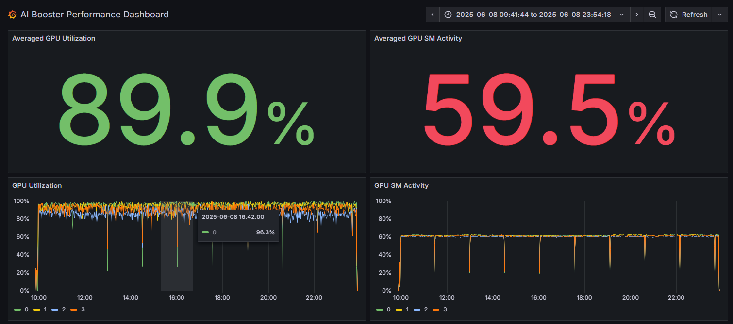
At the top of the Performance Analysis View, the left panel shows the overall "GPU Utilization" of workloads running on the system during the observation period. The right panel shows the average SM utilization, where SM stands for "Streaming Multiprocessor." Each GPU consists of many SMs, and this panel displays the average utilization rate across all SMs. When both values are close to 100%, it indicates highly efficient GPU utilization.
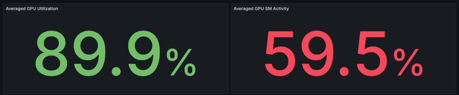
Even if the overall GPU utilization is 89.6%, the internal SMs might only be 59.5% active. This indicates that there is still room for performance improvement in the system.
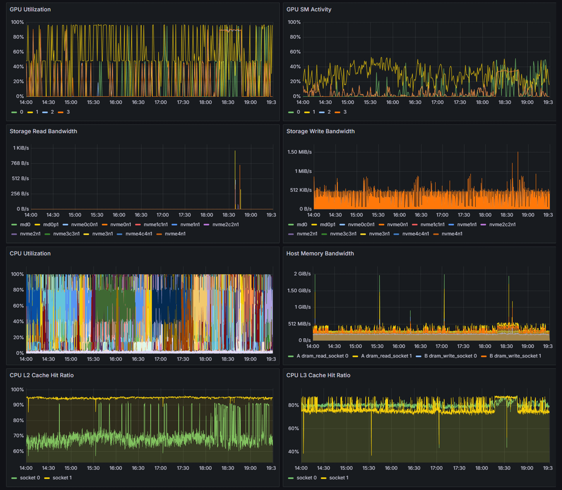
The following panels display 10 types of performance metrics as time-series graphs:
- GPU Utilization
- CPU Utilization
- CPU L2 Cache Hit Ratio
- Interconnect Send Bandwidth
- Storage Read Bandwidth
- GPU SM Activity
- Memory Bandwidth
- CPU L3 Cache Hit Ratio
- Interconnect Recv Bandwidth
- Storage Write Bandwidth
A flame graph is a visualization of software execution time, intuitively showing which functions or libraries consume the most time. The vertical axis represents the call stack (depth), and the horizontal axis represents the proportion of execution time. Longer bars indicate more time spent, which helps in identifying performance bottlenecks.
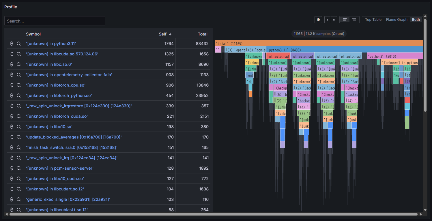
Both a table of library/function names and a flame graph are displayed side-by-side. You can also view each of them individually.
You can change the observation period from the drop-down list at the top-right of the dashboard.
You can also specify a detailed time range by clicking and dragging on the time-series graphs. The dashboard will redraw to reflect the selected range, enabling more detailed analysis.
- Click the "Start Demo" button.
- The Performance Observability (PO) dashboard for the Performance Analysis View will open in your browser.
- Feel free to explore the various panels.
Note: In the product version, you can freely customize the size of each panel, the type of graphs, the data to be displayed, and more.